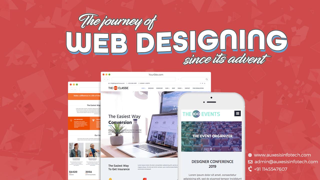
The journey of website designing has been extensively evolving ever since the creation. A company’s website is the key principle to their business, so we decided to do some research and take you on a journey of website designing since its advent.
The Prehistoric Year – 1989
This was the very beginning of web design and it was dark, literally. Screens were black and white and only a few monochrome pixels. The web design trend of 1989 was based on palette given; there was no design element to play with. Design, during this time, was made via symbols and tabulation and color choice was only black and green.
The birth of HTML – 1990
The official language of the World Wide Web and was first conceived in 1990. Hypertext Markup Language (HTML), the coding language that can be read by web browsers to be translated into web pages.
Table Based Web Design – 1992 to 1995
In 1992, table-based web design was launched and it quickly takes over the entire internet. It was the new option available to structure the information and design in the concept of tables while using HTML. This was also the time when the term slicing designs became popular. Now, designer and developer have the option to break the design into small pieces and figure it out the best way to make that design work.
Transformation of Web Design – 1995 to 1998
The year of 1995, was the new innovation period for the web designing industry. PHP, Hypertext Preprocessor has appeared as a server-side scripting language which made simple web applications, such as web forms, a reality. A new dynamic, open source programming language Ruby, was introduced to with a focus on simplicity and productivity. Javascript was also released that adds up in animation and interactivity to websites.
The year 1996, break all the limitation of the web design. A new technology CSS, Cascading Style Sheets was born, that results in a better approach to structuring the web design. The look and formatting are defined in CSS. The same year Flash was launched, to create any vector image, design any shapes, layouts, animations, interactions all this in one tool.
HTML was majorly improvised in 1997, with the introduction of HTML 4.0. That was the first version to include CSS to provide precise control of data within the page.
The Year Of Navigation & The Y2k Bug – 1998 to 2001
In the year 1998, PHP 3 was released. It results in creating a dynamic web layout with more effective ways. It is also a year when the CSS 2 first draft released.
1999, the developer introduces the new and improved version of CSS3 which has enhance the functions and feature of the web design and development.
The year 2000, was the year of Y2K bug. It was a class of computer bug, related to the formatting and storage of calendar data for dates beginning in the year 2000. Besides this, 2000 was also a great year in the revolution of website industries as the many companies going coming online.
Mobile Uprising – 2007
To browse the website on the desktop to the mobile phone was a completely different scenario. Due to the uprising of the mobile phone, it was a challenge to display the design into the small tiny screens. The website load time on the mobile was also an issue. To resolve all these issues the idea was come upon column grids.
Responsive Web Design (RWD) - 2010
It is an approach to web design which makes web pages render well on a variety of devices and window or screen sizes. If a user switches from the desktop to the mobile phone, the website should automatically switch to the screen size and respond to the user’s preferences. The main benefit was that the same website works on all the variety of devices.
Adaptive Web Design – 2014
The adaptive designs are very much clear and crisp for all the multiple screen sizes. The adaptive designs depend on the variety of screen sizes so with each of the sizes in mind a layout would have to be designed for it. It is quite less flexible than responsive designs because you need to design for each screen size individually.
Flat Design – 2014 to 2018
Flat design is a style of user interface design emphasizing the stylish elements that give the illusion of the three dimensions. It allows the interface to be more effective by using the gradients, drop shadows, texture, web fonts which deliver beautiful typography. Simplifying the elements by using the glossy buttons replaced by icons, the use of the SVG images, (Scalable Vector Graphics) results in the more effective designs
Google’s Material Design is the next dimension style language than the craze of flat design. Material Design makes more liberal use of grid-based layouts, responsive animations and transitions, padding, and depth effects such as lighting and shadows. In this digital era, the user interface has become more important. Designers and developers are working in a new & exciting way to present the website more interactive and user engaging.
You may also like:
Web Design Services That Can Make Your Site Remarkable
Auxesis Infotech – 4 Amazing Things about Our Web Design Company
8 Reasons to Choose a Designed Website Template
Hope you enjoyed reading this interesting evolution about web design and if you want more of such updates keep following Auxesis Infotech
Recent Blogs


Our Clients


_0.png)


Clutch & GoodFirms Reviews
Our success is demonstrated by having the most reviews compared to competitors.
Auxesis Infotech provides web development support on our Drupal platform. They are always flexible enough to help us achieve our goals. Very pleased with Auxesis competance, flexibility, communications and execution.
5

Richard Halderthy
Director Brand & Communications, Saint Gobain Ltd
30 Reviews
Powered by Clutch
I'm impressed by their communication and speed of action. Ever since we launched the redevelopment, there’ve been many compliments on the improved look, functionality, and ease of navigation.
5

Ryan Titley
Director of Projects, ERRIN
30 Reviews
Powered by Clutch
Get in touch with us!
Please fill in the form below, and one of us will get you or respond to your queries soon.