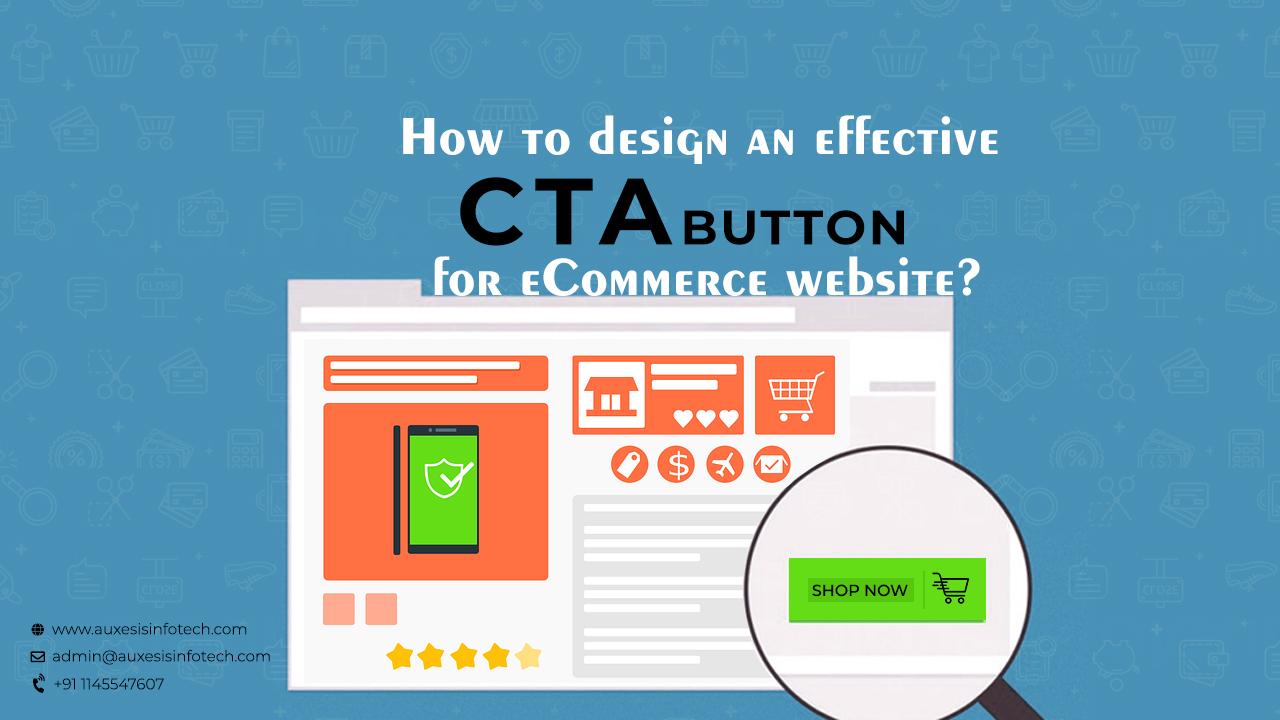
We all know that visitors who don’t click don’t convert. And, when it is about conversion rate optimization, your call to action buttons are your gateways from one stage of the conversion funnel to the other. Call to action (CTA) may appear remedial and obvious, but they are one of the most powerful tools for sustaining the conversion rate of any website. So, it’s important for your business that your CTA’s be properly designed. Let’s see how to create a well-designed call to action button to increase conversion rates.
1. Color and its effect-
Color is what makes your call to action button visible to your visitors at the landing page. So, don’t pick up any color for your call to action buttons. Make sure your call to action buttons stand out and for that use contrasting colors. But, remember this color combination should go well with your overall branding and appeals to the emotion of your audiences.
2. Properly place it-
Your call to action button is very important at your site. So, make sure it doesn’t get buried under the folds. Placing your call to action buttons in the sidebar leaves your visitors to get confused. So, remember it must fit well within your website page design.
3. Be creative
Using the call to action buttons at your website is nothing less than art. So, be creative with your call to action buttons. But, testing your creativity is also vital! So, test frequently to see how well your visitors are taking your creativity call to action endeavors.
4. Shape matters-
Experiment with the shape of your call to action button to find the best one for your website. However, experts believe that a bigger call to action buttons increase conversion rates by 10 to 25%. So, the bigger your CTA button will be, the more likely are people to click on it.
5. Get Fancy with Button Graphics-
In some cases, small graphics on your CTA button can positively affect click-through-rates. So, if you’re going to include graphics, make sure that your icons clarify rather than confuse the offer for users.
You may also like:
Where To Find Professional E-Commerce Services?
Every CTA offers an opportunity for a micro conversion. So, design your CTA’s well to convert your visitors into efficient clients.
Recent Blogs
Our Clients





_0.png)



Clutch & GoodFirms Reviews
Our success is demonstrated by having the most reviews compared to competitors.
Auxesis Infotech provides web development support on our Drupal platform. They are always flexible enough to help us achieve our goals. Very pleased with Auxesis competance, flexibility, communications and execution.
5

Richard Halderthy
Director Brand & Communications, Saint Gobain Ltd
30 Reviews
Powered by Clutch ![]()
I'm impressed by their communication and speed of action. Ever since we launched the redevelopment, there’ve been many compliments on the improved look, functionality, and ease of navigation.
5

Ryan Titley
Director of Projects, ERRIN
30 Reviews
Powered by Clutch ![]()
Get in touch with us!
Please fill in the form below, and one of us will get you or respond to your queries soon.
