Web Design Tips for a Professional Site
The Internet is full of web design tips and tricks available for dime a dozen. Everyone seems to have their own opinion on how a perfect website looks like! To an extent, I can say, like content, the design is also subjective. What may be amazing to you might be hideous for someone.
An effective web design is one of the most crucial reasons behind the success of a business. Studies and surveys reveal some of the following shocking web design statistics:
• 38% of the internet users stopped browsing a website if they found it unattractive.
• 40% folks leave the website right away if it loads later than 3 seconds.
• 94% base their impression of the business on the basis of their web design
• 75% judge business credibility from their website
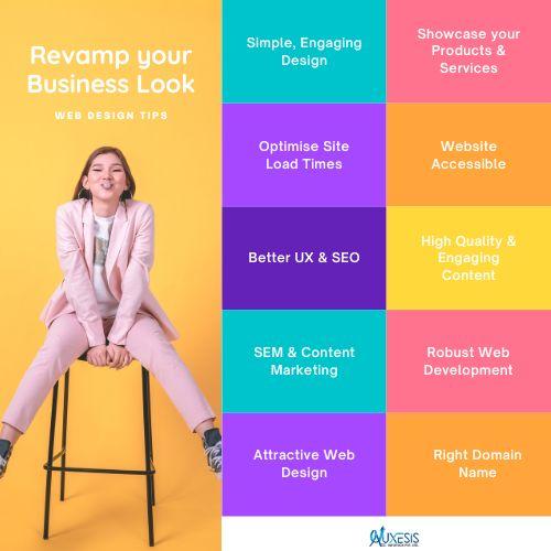
Apart from a compelling web design and thought-provoking content, it's about the style that dwells on the user experience and that's easy to scan, read, and understand. Here are some research-based web design tips and tricks to ace your next web design project:
5 Web Design Tips and Tricks to Drive More Business
• Keep Your Homepage Minimalistic and Clutter-free
No one reads the entire website content. Rather they just scan through the pages quickly, take out important cues, and form a rapid opinion about the website and business. With such behaviors tapping into web space, it's important to focus on striking human emotions rather than content word count.
This is proven that less someone has to read or click on your website, faster he is able to retain the information gathered and acting upon it. Isn't that you want him to do ultimately? No, I'm not saying text and call-to-action are not important but breaking them into legible paragraphs, headings, and subheadings would do the job.
As images and icons wherever possible to express your point.
• Keep a Visual Hierarchy in Mind While Designing
Technology and phones have long evolved and so has the form of expressing information. With so much information in the form of texts and graphics is onboard to offer to readers, it is a designer's mastermind to strategically arrange and exhibit the information in a legit manner.
You have only a few seconds of the window to grab a reader's attention and make them stay on your website. If your website is poorly structured and doesn't follow a hierarchical pattern, chances are you're going to turn off the reader almost instantly.
Organize your website into clear and digestible pieces of content. Pick the right color, contrast, spacing, and size for further enhancement and you're great to go.
• Ensure Easy Readability
Thumb rule is " What you can't read is what you can't see." Make sure that your website doesn't lack easy readability. The readers on your website must be able to recognize words, sentences, and phrases clearly. Having a high readability score means your readers are able to take in the information without much effort and are able to retain it for a longer period of time.
To achieve website readability make sure there is ample contrast between the text and the background for the text to play. Make sure the colors you're using must be coherent with your brand's identity.
Keep body text font at least 16 pt. to appeal to the readers' eyes without much difficulty. Carefully select the font to appear soothing and makes for an easy readability score. If you're using a variety of fonts throughout the website, make sure they look harmonious and clutter-free.
• Easy Navigation is the Key
Don't send your readers on a wild-goose chase when they come on to your website looking for something. A website with a robust navigation system ranks better on search engines and enhances reader's experience in content indexing.
Synchronize your branding efforts with your brand's logo and linking it to your homepage to save your users some precious clicks. The menu bar is ideally on top of the homepage with sections arranged according to their significance.
Vertical navigation also works well when your website is of the long-scrolling variety. Users can easily navigate to the top, bottom, left, or right with the help of anchor menu. Another important web design tip is to include all the contact information, social media plugin links, blog, FAQs, and terms of use in the footnote of the webpage.
• Stay Upbeat with Mobile-Friendly Site
We live in a society where a smartphone is predictably the given medium to access any information. Having a responsive mobile design is of vital importance as not having one might jeopardize your chances of turning a lead into a conversion. Test your website thoroughly to see how each page, image, button or link appears to a mobile user. Conform to the best practices of a mobile-friendly website before going live.
This is just a needle in the haystack when it comes to best web design tips and tricks, never cease to look for inspiration around you. It's important to know what best can be done in order to get it done.
Auxesis Infotech is the place to be at if you're looking to get made an amazing website your business that not just sells but also lingers in the mind of the readers for long. Get in touch today!
Recent Blogs
Our Clients


_0.png)






Clutch & GoodFirms Reviews
Our success is demonstrated by having the most reviews compared to competitors.
Auxesis Infotech provides web development support on our Drupal platform. They are always flexible enough to help us achieve our goals. Very pleased with Auxesis competance, flexibility, communications and execution.
5

Richard Halderthy
Director Brand & Communications, Saint Gobain Ltd
30 Reviews
Powered by Clutch ![]()
I'm impressed by their communication and speed of action. Ever since we launched the redevelopment, there’ve been many compliments on the improved look, functionality, and ease of navigation.
5

Ryan Titley
Director of Projects, ERRIN
30 Reviews
Powered by Clutch ![]()
Get in touch with us!
Please fill in the form below, and one of us will get you or respond to your queries soon.
