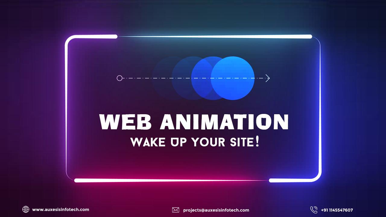
For you, what kind of a website will be more appealing - an old-school website with almost no images and dull interface or the one with transitions, image gallery, and high user experience (UX)? Without a doubt, it will be the one with better UX, isn’t? Well, it’s because of the good animation that the website includes. For human eyes, elements that shift, travel, or slid are more appealing and easy-to-understand and web animation does that all.
You cannot deny the fact that a website has to be well-presentable in order to be unique and distinctive from its contemporaries. And one of the ways to achieve that is by adding animation to your website. Wondering how? Well, let’s find out in detail!
An Introduction to Web Animation
Gone are those days when the word ‘animation’ was used just for cartoons. In the space of web design, the animation is the outcome of bringing two-dimensional images into life. An animation appears to move in a way that follows the laws of physics. Small hover effects and full-screen moving images are examples of web animation. A good animation contributes significantly to make a web application or a website enticing and user-friendly. For a fact, the apt animation is capable of building a strong user experience of a website.
How Animation Appeared in Web Design
Animation in web design is something that we are witnessing or getting to see more of every day. I would suggest, do not dare to make a mistake by assuming that web animation emerged in recent times. For a fact, it appeared on the web a long time ago. Earlier there were just gif files with moving pictures and video clips. That was the time when animation was not considered as a means to improve the usability of a website.
With the passage of time, numerous changes were incorporated in the animation technology. Flash technology brought the revolution but the loading time of the website increased because of the heavy animation files.
More advanced technologies were introduced in the later years. At the present time, animations are created with lightweight CSS and JavaScript coding that is more efficient and effective for the website. And today, animations are not just included on a website for the sake of doing it, but to add a better user experience (UX) to it. It’s amazing to see the transformation of web animation, from an optional element to an important aspect of a successful business website.
Most Effective Types of Animation
The entire industry of developers is following some cool and thoughtful animation trends in web design. Let’s have look at these trends:
- Loading Screen
The primary objective of web animation is to distract users from loading times. For a fact, loading animation is one of the oldest tricks and yet the most effective one. Even for short loading time, this animation adds a little entertainment for the user during the dead time. But, the focus of a developer should not be much on this animation as the main objective of a website is to provide essential information to its users, and hence, the loading time should be as minimum as possible.
- Photo Galleries and Slideshows
A gallery is probably the most animation one gets to see on a website. And adding a slideshow effect makes it even more appealing. However, the number of images and slideshow timings totally depends on the designer. Hence, the decision should not be taken lightly as it can make or break the entire charm of this animation. Try to keep the standard size of the design and ensure that an image lasts for 5-8 seconds on the slideshow.
- Hover
Hover is one of such animations that arouse the evergreen curiosity of users to click on a particular icon. It highlights icons on scrolling the cursor over them. In some cases, the animation also highlights images and texts hidden beneath the icons. Apart from imparting information, Hover also allows users to know whether or not a particular option or text is clickable.
- Menu Navigation
One of the prevailing graphic design trends is the navigation menu. There should be a minimum number of clicks for users to reach to a particular section of a website. And for that, the best animation is the hamburger icon. This also saves some screen space. But, wait, that’s not the only option for menu navigation, many creative designers also use elements like sticky bars and sliders to make the animation enticing.
You may also like:
Mind Your Business With Motion Graphics!
So, this was all from this post. Hope you’ve found it informational. For more such amazing posts check out our blog section.
Recent Blogs
Our Clients




_0.png)



Clutch & GoodFirms Reviews
Our success is demonstrated by having the most reviews compared to competitors.
Auxesis Infotech provides web development support on our Drupal platform. They are always flexible enough to help us achieve our goals. Very pleased with Auxesis competance, flexibility, communications and execution.
5

Richard Halderthy
Director Brand & Communications, Saint Gobain Ltd
30 Reviews
Powered by Clutch ![]()
I'm impressed by their communication and speed of action. Ever since we launched the redevelopment, there’ve been many compliments on the improved look, functionality, and ease of navigation.
5

Ryan Titley
Director of Projects, ERRIN
30 Reviews
Powered by Clutch ![]()
Get in touch with us!
Please fill in the form below, and one of us will get you or respond to your queries soon.
