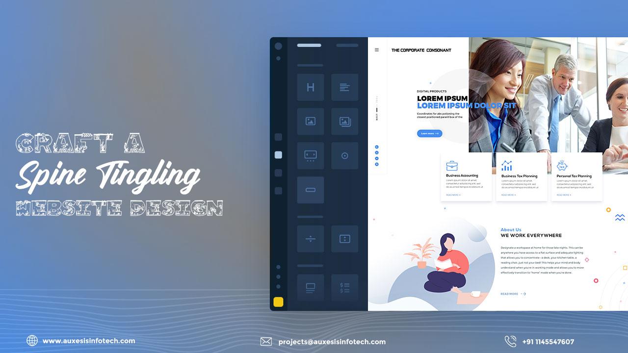
Can you imagine a garland without flowers? Or painting with no shades of hues? It is difficult, isn’t it? Of course, you cannot imagine incomplete things which do not originate in their real form in a more presentable manner. Similarly, a website will not attain its real essence without its design giving it a different feel that would keep the audience starstruck and will not fade away from their vision. But choosing the perfect match to your business is a huge task that you need to be decisive while arriving at. You must know that when you have accomplished your lesson of target learning, you will not miss the tick. Once you have matched up with the beat of audience preference and needs on one hand and your direction where your business is heading towards, you would get a real gut feeling as to what to choose as your website visual representation. Let us learn how to choose your brand motivator wisely without rampant mistakes!
Peak picks for a Website Design
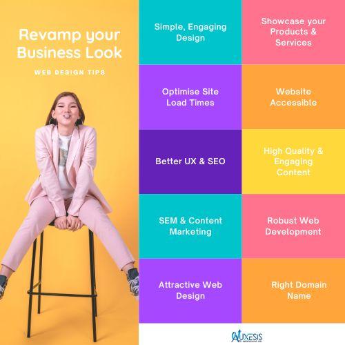
Font Fad: The font size and type that you would select for your website would represent the bunch of texts in the same for designs and thus, must be appealing to the eyes and readable on the very first notice. Remember, the fonts can create miracles within tweaks!
Colour Compassion: The colours speak the voice of the website through its shades and shimmers. There must neither be a monotonous tincture of colours or overt usage of them which strains the eyes of the viewers discouraging impressions. Thus, the colours for the display must be chosen wisely!
Symmetry sign: When you play with the website balancing, make sure that you have acquired expert eyes to notice the symmetrical magic. You must always cover the thin line difference between the symmetry and asymmetry as it would make huge differences in the outlook of the website content and design.
White Space: White spacing is essential for making the images or designs look more appealing and fine in structure and feature. The white spacing allows some room for the texts and images to be noticed properly as to what is there up for them.
Unity and Consistency Stories: When it comes to maintaining sync between the graphics and texts inside the website. Consistency is the quantity and quality type of the fonts, images, icons, colour scheme and other such elements highlighting the website!
What should you expect from your website?
When you have laid the foundation of a completely new website, then it is your responsibility to take charge of both its identity in the form of design. For designing the same you need to be concerned with certain exceeding in your expectations when it comes to designing your website.
When you have fallen for the website, then you need to know how to feed it with tech fodder. The tradition of the day follows videos, Gifs, and animations which can express your business adventures in the best manner through storytelling without any efforts lying on the part of the audience. It allows the audience to gather every possible point about the business without brain and eye strain. The motion adds life to how the audience interacts with the business and the impression that it outwardly pours on their memories.
Until and unless you are accessed through all sources of electronic device that an individual can use in a day at any time of the day, you are not ready to fight the battle. You have the responsibility to verify the presence of your website through its fonts and images to evaluate its look across the various screens as it is mandatory to be proved responsive!
Your website must be filled with content-rich blogs which would allow you to get into sensitive business results. The blogs allow words to hit the blank space to quench the curious rush inhibit in the audience. The words create magic when they are integrated with the designs that seem to complement the website.
You may also like:
How Can You Become Playful With Portfolio Website?
User Persona Is The Mirror To User Experience
UX Writing Steals Your Audience’s Eyes
Just the gist is not enough to count on the whole book and thus, many factors need to be accomplished to complete the quality of the website. The other add ons to the above elements and functionality would be the readability factor, the usability of the audience and also the navigation purpose that needs to get resolved too.
Recent Blogs
Our Clients




_0.png)



Clutch & GoodFirms Reviews
Our success is demonstrated by having the most reviews compared to competitors.
Auxesis Infotech provides web development support on our Drupal platform. They are always flexible enough to help us achieve our goals. Very pleased with Auxesis competance, flexibility, communications and execution.
5

Richard Halderthy
Director Brand & Communications, Saint Gobain Ltd
30 Reviews
Powered by Clutch ![]()
I'm impressed by their communication and speed of action. Ever since we launched the redevelopment, there’ve been many compliments on the improved look, functionality, and ease of navigation.
5

Ryan Titley
Director of Projects, ERRIN
30 Reviews
Powered by Clutch ![]()
Get in touch with us!
Please fill in the form below, and one of us will get you or respond to your queries soon.
