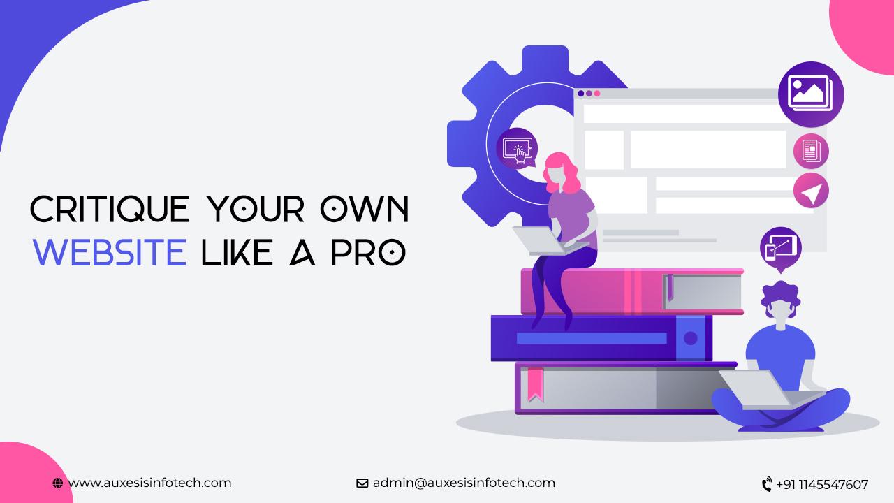
Why Critique Your Own Website
I'm sure you must have asked your family, friends, and associates about feedback on your website at some point or the other and must have got vague comments but no actionable points. Did it get on your nerves? If you're trying to analyze your website yourself, you'd be left clueless on where to start and how to go about it, particularly if you've built your business website.
Looking at your website objectively requires a third eye, where you can see a real person navigate through your website and give comments. There might be hundreds of online website testing tools available on the web if you search how to critique your website, but these tools and testers aren't what your target market is.
Reviewing a website can be done by any friend of yours whose opinions you trust or a well-structured review from a competent web design company with professionals on the deck. Thinking of how to critique your own website, you need to get into the shoes of your customer and think like what they think. Here are few touch points to consider when planning to critique your own website:
6 Ways How to Critique Your Own Website
• AESTHETICS AND VISUAL IMPACT
"94% of a user's first impressions of a website are design related."
"75% of the online users admit to forming an opinion about the credibility of a business based on its website."
Whether a visitor enters your website through services page, blog, or homepage; you need to evaluate the initial visual impact your website leaves on your customer's minds. Ask yourself these questions?
· Is my website clean and sleek?
· Is it easy on the eyes?
· Are the pages too blocky?
· Are they overloaded with colors?
· Does your eyes struggle to focus on a point?
· Are the fonts readable enough?
Do this exercise throughout as many pages as you can and let the answers to these questions help direct your train of thought.
• NAVIGATION
A website's navigation is the fundamental way of users forming an opinion about who you are, what's your business, and why they are there on your website. Now imagine a user is looking for further resources, is he able to decipher the website's navigation and find what he needs.
Streamlining your navigation is the most important thing to consider if thinking of how to critique your own website.
Ask yourself these questions:
· Is your navigation pane located at an easily accessible area of the site?
· Is there clear spacing between the content as what's connected and what's separated?
· Can a user decipher about the nature of your business by looking at your navigation bar?
· Is the call-to-action clear throughout your navigation?
· If you have a fairly large website, can you condense the labels and group the information under clear labels?
• CONTENT EVALUATION
Reviewing the website is one of the most challenging tasks when it comes to how to critique your own website. It's difficult because we often tend to review it the way we are reading it, not the way a first time user will.
Your content must be nurturing enough to answer a user's pain areas and addresses their solutions effectively. You need to remember your market segment and mold your content according to the target audience in a way that adds the right quality and value for your users.
Ask yourself these questions:
· Is your content worth reading and has the variety that caters to all user segments?
· What is language like? Is it brand-focused? Does it have any personality?
· Is the content too much focused on the brand talks more about the user or buyer?
· How is the content getting presented? Is the content too long? Is it easy to find? Is it organized? Is it too small or too large?
• USABILITY
The next step in the journey of how to critique your own website is to determine its usability. There's nothing more nerve-wracking than having a website that users don't know what and how to figure out.
Are there pages on your website where your users felt the same emotion as you while making it? Focus on having a website that offers more usability that benefits the user. If your website has features that are too disruptive for the users, chances are they won't stick around.
Ask yourself these questions:
· How fast is your website's loading time?
· Can users easily navigate through the pages and determine what information or call-to-action would be found where?
· Are all pages of your website intuitively placed?
· Does your website has a unique functionality?
· Is your website responsive and optimized for the users?
• GALLERIES
Often forgotten or overlooked, gallery positioning is one of the most crucial steps in the journey of how to critique your own website. Surprisingly, I have often seen developers following more than one gallery style in the website which is a strict no-no.
Check for consistency of pages and the best pages are the one that gives the control of galleries in the hands of the viewers. Animate your slider, lightbox, and make sure your users can easily pause the images, move forward or backward. It's extremely critical to have swipe control of galleries while on mobile.
• MOBILE RESPONSIVENESS
This brings us towards the end of the process of how to critique your own website. Real-time mobile testing of a website is extremely important because more than 65% of the website traffic comes from mobile and other devices.
Having to see pinch and zoom text on mobile is annoying and with Google's Mobile First Index, you need to have a responsive website by any means.
Get Critiqued!
Now you have all the reference questions and materials to go about how to critique your own website. However, if you're still looking for an industry professional to help you out, Auxesis Infotech is here to guide you. Reach out to us and we'll fix the problem areas for you.
Recent Blogs


Our Clients


Clutch & GoodFirms Reviews
Our success is demonstrated by having the most reviews compared to competitors.
Auxesis Infotech provides web development support on our Drupal platform. They are always flexible enough to help us achieve our goals. Very pleased with Auxesis competance, flexibility, communications and execution.
5

Richard Halderthy
Director Brand & Communications, Saint Gobain Ltd
30 Reviews
Powered by Clutch ![]()
I'm impressed by their communication and speed of action. Ever since we launched the redevelopment, there’ve been many compliments on the improved look, functionality, and ease of navigation.
5

Ryan Titley
Director of Projects, ERRIN
30 Reviews
Powered by Clutch ![]()
Get in touch with us!
Please fill in the form below, and one of us will get you or respond to your queries soon.