Website First Impression
Do you remember your first job interview? Most people tend to remember it because either they bagged the job or screwed it up. An interviewer judges you within first 7 seconds based on your appearance, facial expressions, or more. A customer's first impression of your website isn't something too different.
When people judge your website and your business and if they don't find it attractively packaged or branded in a way that impresses them, chances are they won't return to your business and website even if your products solve their problems. Website first impression is that important, you see!
WHAT RUINS A WEBSITE FIRST IMPRESSION
Even the slightest imperfections on your website can add up to pissing off a user and keep them from returning to your website or business ever again. An average spends 15 seconds on a website judging it based on appearance, navigation, content, and overall look and feel. So you don't have much time at hand to cast that right first impression of your website.
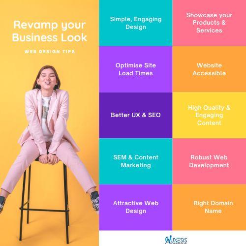
Spoilers to a great website first impression include a crazy color palette, slow loading time, poor navigation, unwanted pop-ups, forced video, unpleasant layout, and more.
You obviously want your users to stick around to your website and make their purchase decision of your product or service based on your website first impression. Here are 5 ways to ensure your business is casting the right first impression with a website.
5 Ways to Make an Exemplary Website First Impression
1. INTRODUCTORY VIDEO
"60% of online survey respondents stated that they would prefer to watch videos than reading through the text."
When you only have a window of 15 seconds or less to make the right first impression with your website, the faster they get that information makes your chances of conversion better. This is where an introductory video steps in! place it on your homepage and auto-play when the website is opened.
This is a good way to avert bounce rates as users might get overwhelmed by the quantum of information laid in front of them. An introductory video works because not just they can find the information relevant to them but can also see it in action to get it registered in their minds quickly and intuitively.
The quick tip here is to keep the length of the introductory video to up to 120 seconds or less summarizing your company, products, and how it can take on their problems in an attentive and persuasive manner.
2. VALUE PROPOSITION
Before anyone else, critique your own website and ascertain whether visitors coming to your website can find the solution to their problem? In short, does your website offer a clear value proposition to its customers?
The value proposition is a statement that exhibits what does your business do, how it solves anyone's problem and why does the customer care to come to your business. The best way to cast the right website first impression is to write two to three compelling sentences of value proposition and place it at a prominent location of your homepage to grab their attention in a snap.
3. SCROLL, SCROLL, SCROLL, OKAY STOP!
As much as I would want, but above the fold, below the fold websites are right there in the garbage bin and nobody bothers reading them now. Today's users' love, expect, and get to scroll!
With single page websites ruling the web design trends for quite some time now, a longer and more robust page lets you have the liberty of emphasizing on the key factors that might pull the quantum of traffic on your website.
The different sections a website homepage should have are service areas, testimonials, About us section, offers, case studies, product videos, and more. Give your users plenty of reasons to explore your website and scroll till the end to dig the information they're looking for.
4. DIRECT USER'S EYES TO CTA
The Call-to-Action (CTA) button is the heart of your website and you have to mind that accordingly. It drives your visitors to that direction of the website where you want them to take the needful action.
Make sure your CTA area stands apart from your website without breaking the reading flow and shouldn't be overdone. The CTA button acts like a trigger for the user to hit the desired action button instinctively and hence, should be designed in contrast to the overall color theme to stand out prominently.
The three main locations to place the CTA button are at the bottom after pitching your services, in the middle amongst other important points, and at the side to grab the attention quickly for the right website first impression.
5. DEVELOP TRUST WITH YOUR WEBSITE
While you may be the best web development company in India but don't really brag about just yourself over the website. Your website must be able to touch the right chords and the products or services should offer a problem-solving context.
For the right website first impression, you may allow your target viewers to subscribe to informative articles, blogs, download ebooks, and read interesting infographics and related resource material. This goes a long way in building the credibility of your business and makes customers believe that your products can solve their problems.
WRAPPING UP!
As brutal as it may sound, your users aren't looking for fluffed up content and irrelevant imagery on your website. They have landed upon your website looking for a certain solution to their problem and if your website fails to provide that, I afraid saying that you're miserably failing at casting the right website first impression.
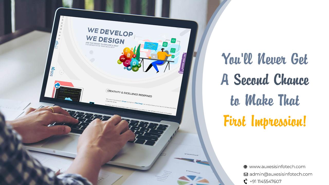
When it comes to creating awesome websites, don't trust anyone but a professional web design company that delivers what it promises. Auxesis Infotech holds an impressive and envious portfolio of commendable web design services so that your first-time visitors end up becoming the promoters and ambassadors of your brand.
Recent Blogs


Our Clients


Clutch & GoodFirms Reviews
Our success is demonstrated by having the most reviews compared to competitors.
Auxesis Infotech provides web development support on our Drupal platform. They are always flexible enough to help us achieve our goals. Very pleased with Auxesis competance, flexibility, communications and execution.
5

Richard Halderthy
Director Brand & Communications, Saint Gobain Ltd
30 Reviews
Powered by Clutch ![]()
I'm impressed by their communication and speed of action. Ever since we launched the redevelopment, there’ve been many compliments on the improved look, functionality, and ease of navigation.
5

Ryan Titley
Director of Projects, ERRIN
30 Reviews
Powered by Clutch ![]()
Get in touch with us!
Please fill in the form below, and one of us will get you or respond to your queries soon.