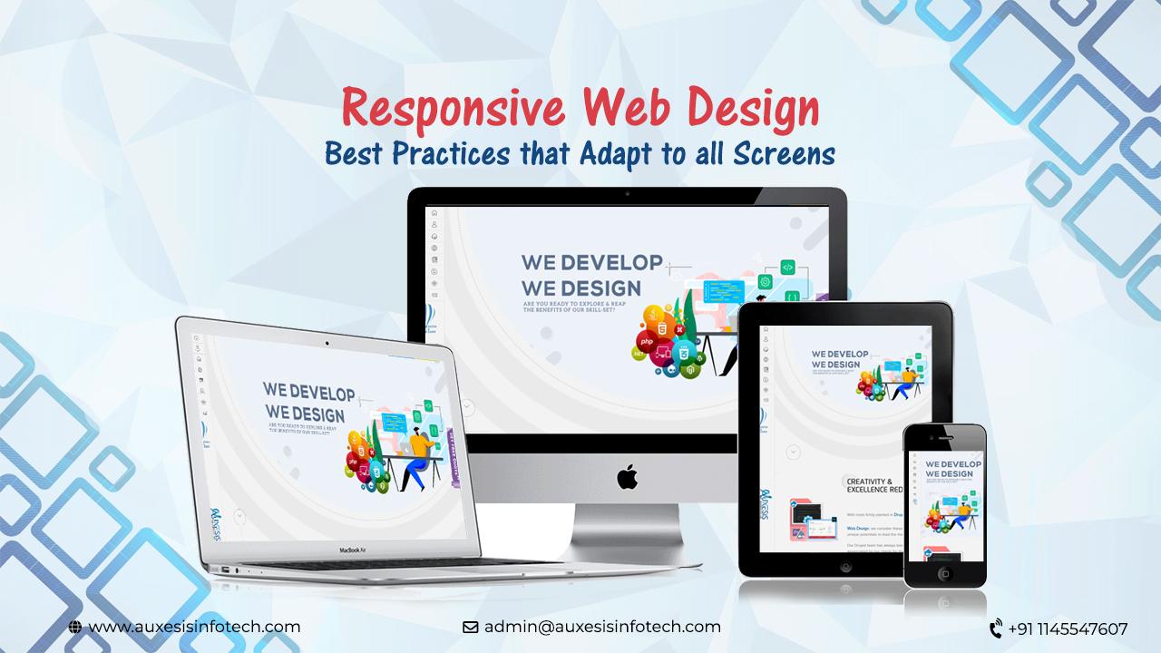
Best Practices on Responsive Web Design
It’s the end of 2018 and the quantum of dependency we have on our phones is growing at an ever-increasing pace. Out of all 95% cell phone users in America, 77% of these are smartphones. Ever thought what would be the outcome of this increase?
More and more people prefer to use their cell phones for browsing the web as its more convenient to just and explore the web on your mobile phone vis-a-vis laptops and desktops and there are numbers to back this up. 42% of Americans use their mobiles and tablets to access the internet beating the number of desktop users very soon.
With such an increasing trend, mobile user experience can’t be overlooked. Here are some of the responsive web design best practices to ensure that the websites have top-level user experience across any device:
Also Read: The Top Things To Know About Mobile First Indexing
Responsive Web Design Best Practices – An Ultimate Cheat Sheet
1. Minimize & Mobilize
12% of the world’s web traffic is contributed by those using mobile phones. Isn’t that a reason solid enough to switch to responsive web design? But saying that won’t suffice. The ideal world scenario advocates providing best browsing experience to your users in terms of appeal, utility, functionality, and aesthetics.
Always adopt the mobile first approach and put your mobile user experience at the forefront considering the mobile screen size constraints. When the design layout is considered for a small screen, only the most essential elements are concentrated on, which are then further optimized to load faster.
2. Prioritize Content Differently
“When everything shouts, nothing is heard”
Most of the responsive design website exhibit one common trait – multiple columns display on devices with large screens and single column display on small screens.
Larger displays usually have a lot of free space and are customized differently as compares to smaller screens. Take, for instance, an article teaser; some teasers are not effective on certain screen sizes so have to be modified to be a certain way.
Similarly, with the content, all of the content displayed on a desktop version website might not be of relevance to the mobile users. If at all, removing some of the content isn’t feasible for you, hide them appropriately behind tappable areas. Pin most important things on top to get noticed.
3. Use Scalable Vector Graphics (SVGs)
Using scalable vector graphics (SVGs) is one of the most recommended responsive web design best practices. These are preferred over typical image files like jpeg and png as these are highly scalable and utilize illustrations like icons.
The benefit of using SVG is that you can rest easy the icons or illustrations will remain extra sharp, irrespective of the device and experience. The end result is a polished and scaled website for the viewers, no matter what the device is!
To add further, SVGs are far smaller in size than their other image cousins and contribute to the faster load times, which is quite crucial in the case of mobile viewers.
Also Read: Make Your Website User-Friendly With These 5 Tips
4. Standardize Clickable Areas/Buttons
While designing clickable areas and buttons, this has to be kept in mind that buttons and links are to be tapped by human fingers and not mouse clicks. Having said that, we need to consider that buttons and areas need to have a larger interactive area than the desktop version.
This will help ensure that are no errors in website navigation and if at all, there are, they don’t result in irritating a user and making them leave the site. Follow this responsive web design best practice tip to make it easy to click accurately, no matter what finger they choose to tap with.
5. Typography Matters
It is important to test and retest your site’s content on all possible platforms and devices, more so in the case of mobile viewers. If your business’s value proposition or any page content, for that matter, isn’t readable on a mobile device, chances are a user won’t even stick around to find out.
Before launching your mobile site, you would want to make sure that your website content is easy to read and optimized for the mobile viewers to read and digest the message properly.
A responsive web design best practice is to balance the headings and body font size as per the device size to please the viewer’s eyes.
You may like also:
5 Ways Outsourcing Web Design & Development Projects Benefit You
Wrapping Things Up!
The points described above are some of the most important responsive web design best practices that work well for any web designer or business owner. At Auxesis Infotech, we specialize in providing web design solutions in responsive web design. We are dedicated to finishing every single project with the utmost focus to deliver the best possible results.
Recent Blogs


Our Clients


_0.png)


Clutch & GoodFirms Reviews
Our success is demonstrated by having the most reviews compared to competitors.
Auxesis Infotech provides web development support on our Drupal platform. They are always flexible enough to help us achieve our goals. Very pleased with Auxesis competance, flexibility, communications and execution.
5

Richard Halderthy
Director Brand & Communications, Saint Gobain Ltd
30 Reviews
Powered by Clutch
I'm impressed by their communication and speed of action. Ever since we launched the redevelopment, there’ve been many compliments on the improved look, functionality, and ease of navigation.
5

Ryan Titley
Director of Projects, ERRIN
30 Reviews
Powered by Clutch
Get in touch with us!
Please fill in the form below, and one of us will get you or respond to your queries soon.