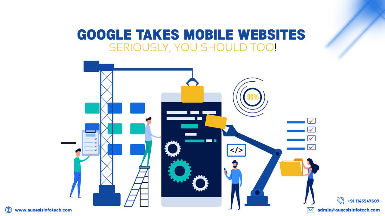
Buzzword – Google Mobile First Indexing – Don’t Panic!
Google mobile-first indexing isn’t something business owners with a website need to be panic off. For those who don’t know what is Google’s mobile-first indexing – Google now crawls up to websites with a mobile agent. Simply put, it now effectively looks at sites as a web browser to ascertain whether it’s running on an iPhone or an Android or Windows device.
Google’s mobile-first indexing has reinstated the fact, “Go mobile or perish” for all websites as having a responsive website design best practices is more than a trend now. The traditional websites that aren’t responsive or mobile-friendly to a mobile user are redundant to Googlebot too. Straightening up, sites that aren’t mobile friendly will have to suffer as far as the Google rankings are concerned.
If you haven’t had review your website to ensure it’s ready for Google’s mobile-first indexing, here’s what you need to do.
How to Prepare Your Website for the Mobile First Update
Here are some quick notes on how to prepare for Google’s mobile-first update:
- Make sure that the pages load faster
- Ensure all your web pages have a mobile equivalent
- Make sure all your web pages clear the Google mobile testing tool
- Go for the responsive design
- Watching for technical hiccups every day if you are using a mobile subdomain
- Focus on mobile CRO and end-user experience
Some more points of Google mobile first indexing checklist are discussed here:
1. Go for Responsive Design
Before you even begin to start looking at anything, hit the first item off your Google’s mobile first indexing checklist – Responsive Design. Ask yourself, is it responsive? Does it automatically adjust to the screen size when it is opened on a mobile device? Does its layout appear differently, seamless, and users are able to navigate easily?
If your site looks fine on a desktop but looks unpleasant and the content is unreadable on a mobile device, then it’s not mobile friendly. If users have to pinch-zoom the text, it’s not responsive.
Fortunately, these problems can be fixed with responsive design on WordPress themes, HTML templates, or Drupal.
2. AMPlify Your Site
Well, technically speaking, you don’t need AMP (Accelerated Mobile Pages) to rank well at Google if you have a responsive website. However, Google favors site with AMPlified pages and ranks them favorably so that is a well-evident reason for you to go for AMPlified pages.
3. Test Your Website with PageSpeed Insights
We all know fast loading pages create a better user experience and that’s the reason Google loves AMP as they load quickly on a mobile device.
Head to Google’s PageSpeed Insights tool and put in your homepage URL for a quick speed check. It will score your website on the points of 1-100 with 100 being perfect. It shows the different score for both desktop and mobile site versions. If your website went on to receive the lesser score, Google will tell what the problem areas are and what needs to be fixed.
4. Test Your Site With Google’s Mobile-Friendly Test Tool
There is a major difference between testing your website for speed and testing it for mobile friendliness. However, all mobile-friendly sites load quickly but not all quick-loading sites are mobile-friendly. Even if the mobile-friendly website loads in a jiffy, the layout of the site may not be eye-pleasing to the user. It is only the Google’s mobile-friendly test tool that can tell you whether your site is mobile friendly or not.
You may like also:
What Is AMP (Accelerated Mobile Pages), Benefits & Drawbacks
How Does Mobile App Development Act As A Daily Digital Supplement?
Top Benefits Of Hiring An E-Commerce Mobile App Development Company
Wrapping Up on Google’s Mobile First Update!
Google’s Mobile First Update has rolled out and businesses are geared up for it. Reckon this checklist before going for the update and ensure a seamless transition. If you want expert design and development hands to hold your project, contact Auxesis Infotech and sit back with your coffee. We’ll do the rest!
Recent Blogs


Our Clients


_0.png)


Clutch & GoodFirms Reviews
Our success is demonstrated by having the most reviews compared to competitors.
Auxesis Infotech provides web development support on our Drupal platform. They are always flexible enough to help us achieve our goals. Very pleased with Auxesis competance, flexibility, communications and execution.
5

Richard Halderthy
Director Brand & Communications, Saint Gobain Ltd
30 Reviews
Powered by Clutch
I'm impressed by their communication and speed of action. Ever since we launched the redevelopment, there’ve been many compliments on the improved look, functionality, and ease of navigation.
5

Ryan Titley
Director of Projects, ERRIN
30 Reviews
Powered by Clutch
Get in touch with us!
Please fill in the form below, and one of us will get you or respond to your queries soon.