Table of Contents
- Introduction
- What is Healthcare UX?
- Healthcare UX- A Crucial Aspect, Still Ignored, Why?
- An Example of Healthcare UX Design that May Inspire You in 2021
- Why Do You Need to Embrace UX in Digital Healthcare?
- Offers Online Consultation
- Reduces Troubleshooting
- Makes the Patient Feel Involved
- Alleviate the Customer Support
- Enhance Patient Experience By Following Top Digital Healthcare UX Trends
- ADA Compliant User Experience Design
- Content Focused Design
- Implement Voice Search
- Purposeful Micro-Interactions to Add Professionalism
- Notifications
- Clickable Icons
- Stacking Slides
- Call to Actions
- Include Tidy UI and Clear Typography
- Add Personalization
- Final Thoughts
When you walk into the different office or even restaurant settings, all have different interiors and a different vibe. Similarly, there are different websites for different businesses that also cover the ones in the healthcare industry. Having an organized website could prove to be a game-changer for your healthcare businesses.
It’s no hidden secret that healthcare leaders, businesses, pharmaceutical reps, and physicians that are operating offline make the best possible efforts to deliver quality medical care to everyone. But, there are times when they are not able to reach out to everyone who needs their assistance.
And not having a website isn’t the only reason for that. Sometimes, even after having a digital product, a healthcare business can fail to reach out to a majority of people because of the unclean user interface, information, and design on its website.
Thus, if you want to reach out to everyone and enhance the patient experience, you have to play smart by maximizing your digital presence through a smartly designed website.
The best way to do so is to build a robust healthcare website design with smart and intuitive UX elements. The healthcare UX should be such that it can reorganize your services considering your patient behavior, ensure better communication, ensure access to information, and enhance the patient experience.
In this blog, we will discuss what is healthcare UX, how it can be beneficial for your healthcare organization, and what you can do to ensure a better patient experience.
Let’s begin!
What is Healthcare UX?
Healthcare UX is related to the user experience of patients while browsing a healthcare website that gives them a common platform to interact and connect with the digital healthcare system.
When it comes to healthcare UX, it is more about usability than aesthetics. The reason behind this is the nature of the industry where patients, healthcare organizations, healthcare leaders, pharmacists, and physicians are the primary stakeholders.
If you look at the targeted users, you will instantly know their major requirement, which is convenience, information, and quick medical assistance. Here convenience of use and data is equal to persuasion that will bring in more patients and users to your healthcare business.
A smart digital solution for your healthcare system with an engaging and intuitive healthcare UX would include hi-tech features depending on the purpose of the website. They should be such that they improve your productivity, reduce workload, streamline operations, and reduce the overall cost of operations while delivering quality care to the patients.
Here are common features from the perspective of a functional and aesthetically pleasing healthcare UX design that you can expect in your healthcare website:
- Mobile-friendliness
- Personalization
- Informative content with a clear message
- Intuitiveness to direct the user to the task at hand
- Fast loading speed
- Simple and easy to use user interface
- Seamless integration to facilitate automation, better resource allocation, fast processing, and accurate data
- AI like chatbots
- Smart ticketing system to book appointments and record patients’ data
Want to get all these features on your healthcare website with expert help?
Healthcare UX- A Crucial Aspect, Still Ignored, Why?
Why UX Design in Healthcare is Often Overlooked?
A UX design is intended to make every customer’s and patient’s journey seamless on your healthcare website. But to create such an impact on your website, you need a strategy and a smart approach considering the industry niche.
A majority of healthcare companies tend to consider this as a long-term process thinking that it would require a great number of resources and investment.
Thus, to save time and resources, they quickly launch a brochure website and soon they realize they need to undergo another designing process. Lack of proper strategy is also a reason that many healthcare websites tend to fall behind and overlook the UX design aspect.
The fact that they don’t have a dedicated design team, it is indeed difficult for them to analyze the design bugs and come up with the best solution.
Therefore, it is recommended that a healthcare business should always approach a reputed web designing agency that can offer a robust healthcare UX design solution.
Other than this, UX design in healthcare is ignored because many healthcare organizations fail to understand their buyers’ persona. Well, you need to comprehend that user-friendly design is also a part of the marketing process. Here you prioritize your buyers’ journey, for which you can implement some smart and effective tips to market your healthcare software.
So, these were a few reasons why user experience (UX) design is overlooked in the healthcare industry.
However, an important thing to note here is that many confuse a good design with a fancy design having a lot of elements placed to enhance the visual appeal.
Therefore, it is crucial to give the development team of coders and designers the freedom to pay little importance to visual design. They should be more concerned about the ease of use and try to create a balance between the two elements - aesthetics and usability.
Now that you are convinced how a smart healthcare UX design can get your patients and customers the best user experience they crave, why not build a feature-rich healthcare website with a stunning UI and UX design?
An Example of Healthcare UX Designs That May Inspire Yours in 2021
Centura Health is a complete healthcare system. It offers healthcare services, including access to hospitals according to locations, healthcare specialists, clinics, and urgent care. Also, it offers a complete patient portal that helps in scheduling appointments, keeping records, bill payments, and more.
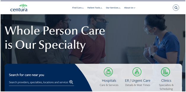
If you look at the healthcare UX design of Centura Health, you will see that the design is clean and simple, showing that they care for their patients. The website design displays a straightforward architecture with clear and accurate information.
Here you will find links to all important services along with intuitiveness, smartly positioned CTAs, and prominent display of search bar. All this makes it easier for the users to navigate the website that enhances its functionality and usability.
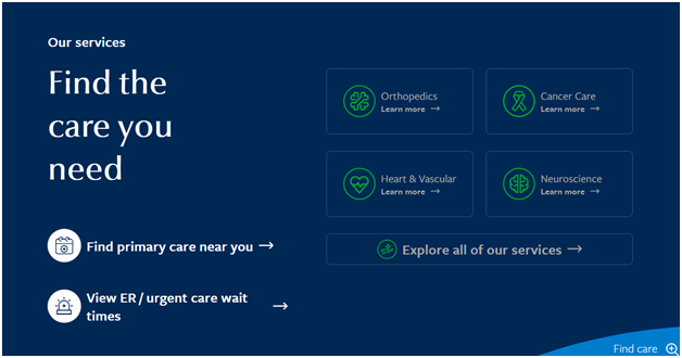
Moreover, the usage of green and white fonts on a contrasting blue and grey background perfectly balances the aesthetics and makes the brand stand out. The users can easily read the content on the website, which is clear enough to direct them for their next course of action.
You can take references from the design above and add your own element to it. It will help you build a smart healthcare UX that will help you stay on the cutting edge of what modern healthcare websites exhibit today.
Want a feature-rich design like Centura Health for your healthcare website?
Know more about our services right here!
Why Do You Need to Embrace UX in Digital Healthcare?
In recent times, there has been a tremendous shift in the global healthcare infrastructure, mainly because of the COVID-19 pandemic. And it’s no hidden secret that healthcare organizations have suffered the most during these times.
To tackle the situation, medical professionals and businesses had no choice but to go online. As a result, today, the online healthcare industry is favored by everyone.
Considering the current needs, healthcare UX seems to be of utmost importance as most people now prefer taking consultations with healthcare professionals digitally. So, to survive digitally, you have to keep up with constantly evolving designing needs.
Other than this, here are a few reasons why you must put your emphasis on a practical and fully functional UX while developing a healthcare website:
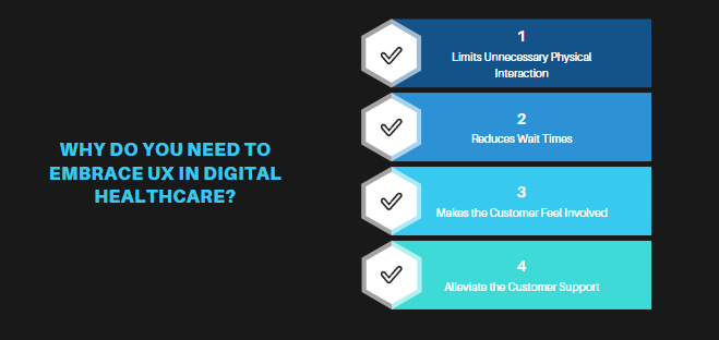
1. Offers Online Consultation
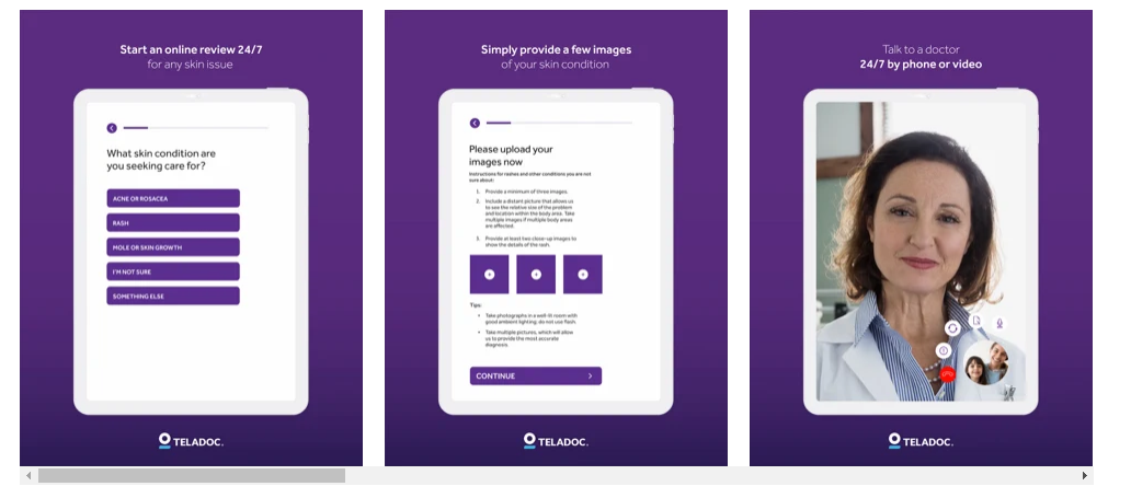
A great UX design will reduce unnecessary wastage of time and contribute to patient convenience and comfort. Addressing the patient’s needs through a simple online form will help you know whether a telephone call/video chat would solve the issue or the patient has to be called to the clinic for further treatment.
It is helpful in situations when a patient discovers some unusual symptoms in the middle of the night or is not in the city/location where his/her preferred hospital/clinic is located, and thus, can’t afford to travel to the dispensary or hospital.
He can simply fill up an online form, connect through chatbots, or just call the hospital administration directly through the website. It is all possible with a responsive UX design.
Also, it will help healthcare organizations understand patient needs and schedule appointments. It will reduce unnecessary wait times and give patients real-time information.
2. Reduces Troubleshooting
Another great benefit of embracing intuitive and smart UX design for your healthcare website is that it reduces troubleshooting time. It happens due to incorrect assumptions about customer behavior, complex navigation leaving customers confused and stuck, or unwanted features that are not needed or are inaccessible.
For example, an already stressed patient would want a clear way of finding information, easy maps, and an intuitive structure that includes dedicated FAQs or CTAs for appointments. If your customer is finding it challenging to get to his goal, you will have a hard time retaining or satisfying him. All this will result in increased troubleshooting time.
Thus, efficiently designing your healthcare website will help you. It will eliminate potential issues from the beginning by giving your patients a clean UI that will enhance their user experience.
3. Makes the Patients Feel Involved
Content makes an integral part of the healthcare UX; so, try to make it informative and interesting. And, when the patient gets all the information online, he becomes a consumer. He feels more involved, and when his need to access information is addressed, it gives him the impression that he is being well taken care of.
Supposedly, you run a pharma business, here you can include the negative and positive effects of common drugs on the human body. It will not only give information about the drug but would also educate your patients.
Hospital administration, pharma businesses, and other healthcare leaders can include such content and personalized tips in their website design to make the entire UX humane.
4. Alleviate the Customer Support
AI and chatbots are integral to today’s modern healthcare UX design. As medical teams and the entire administration are overwhelmed with tasks, it is best to implement messaging and chatbots in the UX design. It will strengthen the support system of the healthcare business, enhance productivity, and eventually improve the patient’s experience.
Other than this, there are several reasons you should consider investing in an online healthcare solution for your business. Well, you might be tempted to invest in healthcare UX after knowing the wide range of benefits it has to offer. But, before you make a final decision, let’s have a look at the latest trends in digital healthcare design that we have discussed in the section below.
Enhance Patient Experience By Following Top Digital Healthcare UX Trends
When it comes to a great healthcare website, the platform also plays an important role. Here we would recommend you to consider Laravel for your healthcare website as it can meet various needs of customers. Other than this, UI/UX design should be aligned to the latest trends. Let’s have a look at the top trends in digital healthcare design that you should follow:
1. ADA Compliant User Experience Design
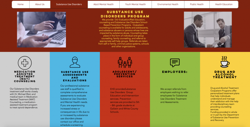
ADA stands for the Americans with Disabilities Act, which requires healthcare organizations to ensure equality for the disabled, even on their website.
Therefore, it is crucial for designers to follow the ADA guidelines to design a website or. It requires them to use assistive technologies to make the website accessible for people with disabilities like blind users, deaf users, and motor-impaired.
Blind users use a screen reader that reads the data aloud and helps interpret it. But, a screen reader cannot describe images but can read image alt texts and meta texts. So, make sure you include ADA-compliant meta texts.
If you have videos on your website, make sure you have an audio description so that people with hearing impairment can also know about the content discussed in the video. Also, people with motor impairment can have issues using a mouse or trackpad, so ensure that the website is easily navigable by keyboard shortcuts.
2. Content Focused Design
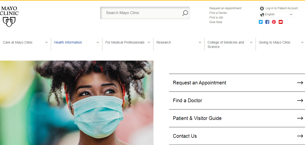
Content is the core of every website design. You can structure and create a healthcare website, but what will you display? If we look at the current trends, we will realize that people want clear and concise information. So, make sure you avoid language with technical verbiage and rather focus on providing clear information.
Moreover, include innovative content such as 3D visuals to give a round view of the medical tools and equipment you use. Scientific illustrations to explain complex medical procedures. Animated videos to display therapies like chiropractic care or mechanisms of specific drugs on the human body. You can also include embedded videos about the products or services you offer to educate your patients about it.
Apart from this, you can include blogs, FAQs, how-to guides, testimonials, announcement banners, successful patient stories, and reviews. All this will not only make your website content-rich and improve the healthcare UX design but will also add to the delightful experience that patients crave in a healthcare website.
3. Implement Voice Search

Voice search is another crucial feature that is a part of artificial intelligence and can enhance healthcare UX design. Nowadays, people are always in a hurry, and hence, voice search technology has turned out to be a boon for present-era people.
They highly rely on voice assistants to search for any query on the internet rather than doing it in a traditional way, which is typing. Therefore implementing this technology into your website becomes important keeping the user research and the market trends in mind.
By incorporating this technology into your digital healthcare product, you make it easier for your users to access any information on your website. A few good examples of questions that people ask through voice search include:
For healthcare agencies that provide information regarding doctors, coupons, discounts, vouchers, and tests:
- Where to find a good cardiologist?
- Where to get a low-cost doctor visit?
- Hospital near me
For websites that provide health-related information:
- How to lower blood pressure?
- Which is the best source of vitamin D?
- How to reduce back pain?
Some general FAQs for all healthcare websites:
- How Can I Pay My Hospital Invoice?
- What are the Symptoms of Common Flu?
So, we can say that implementing voice assistants on your website will not only improve the digital healthcare system but will also enhance the user experience.
4. Purposeful Microinteractions to Add Professionalism
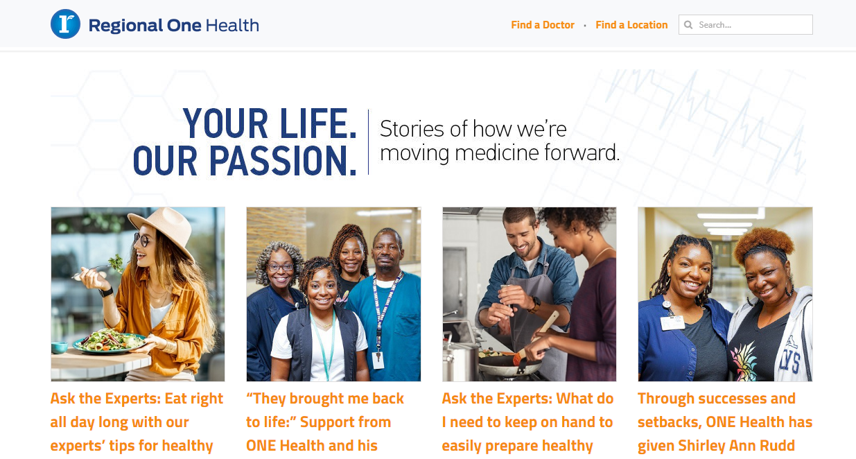
Micro-interactions are moments where a user interacts with the website through its user interface. Designing them purposefully helps to keep your visitors entertained for a long time. You can use different ways such as displaying customer stories, blogs, and more to purposely include micro-interactions. Some of them include:
-
Notifications
Notifications are the best way to keep your audience engaged. Include push notifications and pop-ups in your website design with catchy phrases to attract patients’ attention.
-
Clickable icons
You can also use some clickable icons or some fun animations to draw the patient's attention when they visit your site.
-
Stacking slides
Usually, visitors are frustrated by the slides as they don’t get quick access to the information they are looking for and it wastes their time. But, in place of regular slides, you can consider using stacking slides at the bottom of the page. It will give clear information to the visitors and also use contrasting colors, your visitors will stick to your healthcare UX design.
-
Call to Actions
Use a compelling call to action in your digital healthcare website design. You can use fun animations or pop-ups to encourage the users to click. Using such a persuasive call-to-action encourages the user to act.
Using all of the ways mentioned above will improve your user experience design and will add to your professionalism. Moreover, it will give your users an impression that you value their time and effort to visit your website.
5. Include Tidy UI and Clear Typography

A tidy UI and clear typography are so important that they can lure patients into learning about your services. If your interaction design looks complex and fonts look inappropriate, patients may refuse to click on the services and may leave the website.
We would recommend you to make your healthcare UX pleasing to eyes with simple contrasting colors like grey and blue or white and blue. Consider including appropriate white spacing while giving the users a needed break when they go through your website.
Maintain a proper hierarchy in fonts and arrangement of letters to improve readability and increase the scalability of the texts. Also, be consistent and avoid unnecessary elements taking over the screen.
Be careful and purposeful in designing the layout. Supposedly, a service page is to make people learn about the healthcare website, and a contact information page displays a phone number, a mail ID, or a simple form that asks for a patient’s information.
6. Add Personalization
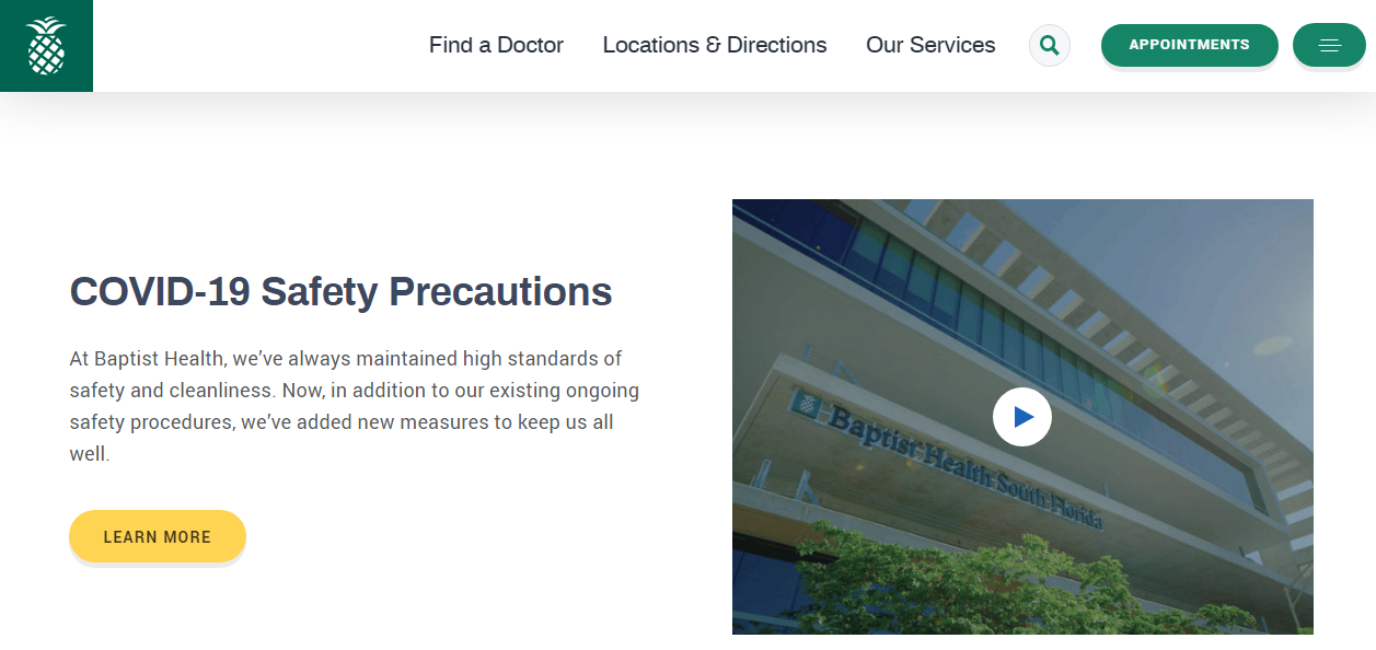
To significantly increase the satisfaction of patients and boost conversions in the digital health care space, you have to add personalization to your website. But, before that, you have to understand the needs of the patients.
Patients are usually in urgency, and they are quickly looking for what they want; so, they avoid lengthy navigation. On top of that, some patients are not able to browse the website for too long; so, they expect quick content delivery.
In all customer issues, you will find the opportunity to add personalization to your website that will enhance healthcare UX design. For that, consider account data of patients or visitors of your website such as:
- Gender
- Age
- Number of Page Visits/Type of Pages Visited
- Searched Keywords
- Number of Online Appointments Made
- Number of Online Forms Completed
- Type of Ads/Email Campaigns/Newsletters Clicked
Based on all these, you can offer them customized appointment calendars, personalized greetings, location-specific services, and more. Also, offer explicit categorization, where you can ask your visitors to select the category of interest like doctors, hospitals, urgent care units, staff members, services, etc. Once they choose their preferred category, they will be directed to the main page.
So, this was all about user-centered design in the healthcare industry. If you are planning to redesign your website and enhance the user experience in the digital healthcare space, you can refer to the points mentioned above.
Are You Ready to Redesign Your Healthcare Website?
Auxesis Infotech is one of the most renowned agencies that offer website designing and development services across various industries. Here you will get stellar services and an accommodating team of industry who will understand your needs and accommodate them into the user experience design.
If you are looking forward to designing a website from scratch or redesigning it, consider contacting us right here!
Recent Blogs
Our Clients


_0.png)



Clutch & GoodFirms Reviews
Our success is demonstrated by having the most reviews compared to competitors.
Auxesis Infotech provides web development support on our Drupal platform. They are always flexible enough to help us achieve our goals. Very pleased with Auxesis competance, flexibility, communications and execution.
5

Richard Halderthy
Director Brand & Communications, Saint Gobain Ltd
30 Reviews
Powered by Clutch ![]()
I'm impressed by their communication and speed of action. Ever since we launched the redevelopment, there’ve been many compliments on the improved look, functionality, and ease of navigation.
5

Ryan Titley
Director of Projects, ERRIN
30 Reviews
Powered by Clutch ![]()
Get in touch with us!
Please fill in the form below, and one of us will get you or respond to your queries soon.
