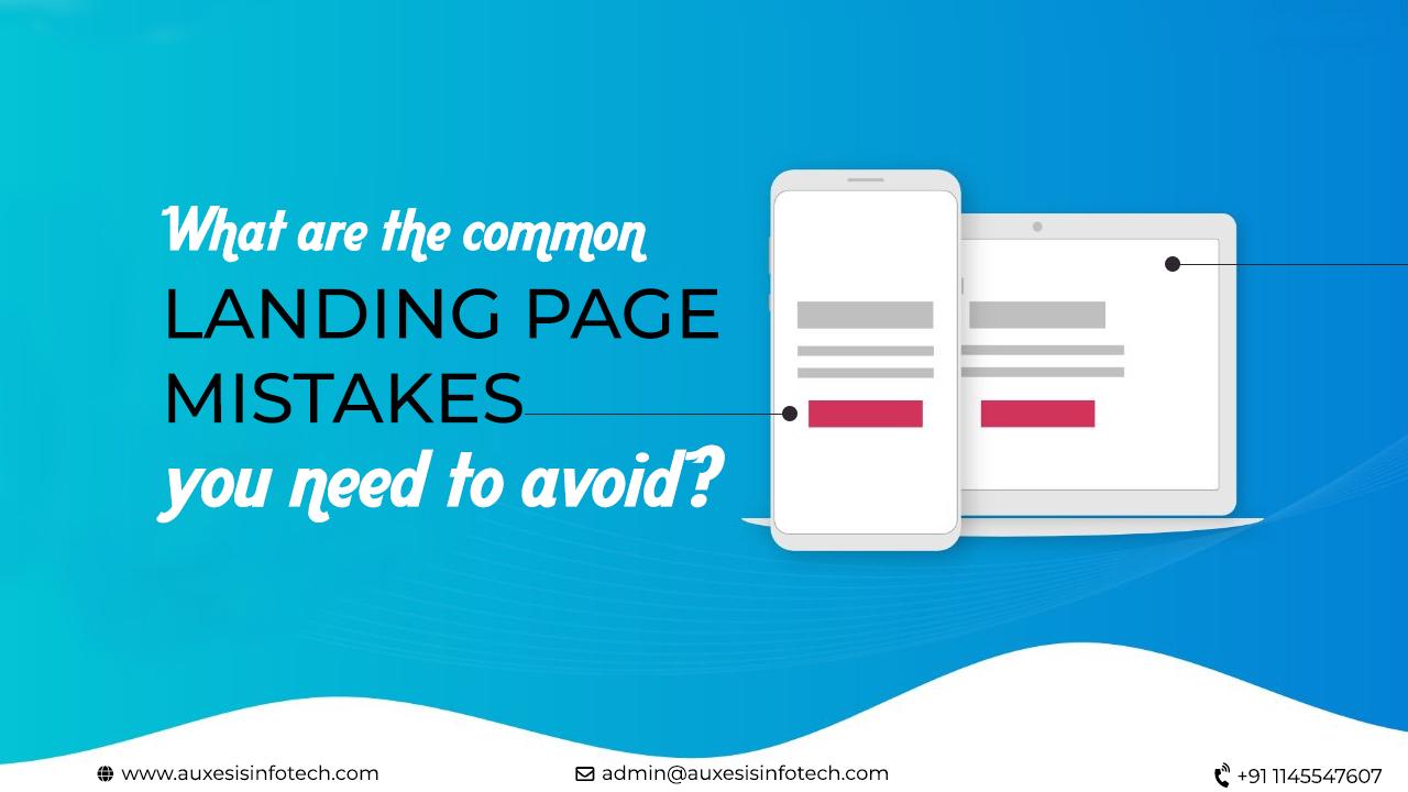
A landing page is also known as destination page where visitors “land” after accessing a link from an advertisement, email, newsletter, or any other type of targeted campaign. According to a study, companies with more than 40 landing pages get 12 times more leads than those with 5 or less. A landing page serves one clear objective, moving a visitor down the conversion funnel. In simple words, a landing page is almost like your makeup the more it is neat and elegant, the more it looks beautiful and appealing. But how can you create an elegant and effective landing page design, without any mistake? What are the common landing page mistakes you need to avoid? Let's have a look at below-mentioned points.
1. Excessive use of Triggers- On a landing page, triggers play a vital role in attracting the user’s attention. They boost the landing page conversion by making the user perform certain things that are useful to the site. However, excessive use of them may overshadow the main idea you want to convey to your visitors.
2. Bad design- Your landing page should be a short and snappy presentation of your brand. The landing page which is not well designed can result in brand inconsistency, which also impacts the conversion you’re seeking with your customers. So, check your landing page design and look it from the eyes of visitors to have a clear perspective.
3. Unclear Call to Action- Call to action is either an image or a line of text that prompts your visitors to take action. On a landing page, the placement and portrayal of the CTA are pivotal in the process of funneling your consumers through to your desired goal. So, keep it clear & simple.
4. Color attack- Color is what makes your landing page attractive and elegant. So, don’t use too much of color to create a certain mood as it distracts the user attention from the message. Sometimes color can even overshadow the whole perception of your text. Hence, choose a clear design without excess color.
5. Wrong Placement of Sign-up form- The placement of the form is critical to the performance of a landing page. Hence, your form should be first in terms of visual hierarchy. The color and format should draw visitors eyes towards the form. This increases the chance of visitors filling it out.
You may also like:
Common SEO mistakes that should be avoided
E-commerce Website Mistakes That Are Turning Customers Away
7 Key Elements of a Website Homepage That Brings in Business
Seen any major landing page design mistakes floating around your web? Contact Auxesis Infotech to have awesome design service for your landing page
Recent Blogs
Our Clients


_0.png)






Clutch & GoodFirms Reviews
Our success is demonstrated by having the most reviews compared to competitors.
Auxesis Infotech provides web development support on our Drupal platform. They are always flexible enough to help us achieve our goals. Very pleased with Auxesis competance, flexibility, communications and execution.
5

Richard Halderthy
Director Brand & Communications, Saint Gobain Ltd
30 Reviews
Powered by Clutch ![]()
I'm impressed by their communication and speed of action. Ever since we launched the redevelopment, there’ve been many compliments on the improved look, functionality, and ease of navigation.
5

Ryan Titley
Director of Projects, ERRIN
30 Reviews
Powered by Clutch ![]()
Get in touch with us!
Please fill in the form below, and one of us will get you or respond to your queries soon.
